14.4.09

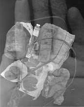
early morning surprise


Have you ever thought of thinking about yourself beyond your shell?
Here is a short personal narrative where my outward appearance becomes
a canvas

12.4.09

act out art


I came across this video while researching how youth can get involved in art interventions. This video is from The Design Studio for Art Intervention, an organization made up of artists, activists, academics, and other social interventionists, based in Massachusetts. Here is their version of "reactivating space like never before" during a crosswalk of tug of war. I love how they stop traffic.

7.4.09

coming soon, very, very, soon


I learned about multidisciplinary artist Shaun Slifer recently who will be visiting Chicago from Pittsburgh to give a lecture at Columbia Collage this next Thursday (April 16th).  His work deals with the human/nature relationship and will be giving a lecture on his work that deals specifically with hunting in America.  In connection to this lecture, Slifer will be installing coyote paws in potholes around town....love it.  He has a range of projects going on from designing railbikes with Richard Bentley and collecting trashed batteries.  I love the way he works and am excited to learn more about this intriguing artist.     

6.4.09

its a hit

A website entryway can easily be a hit or miss.  Often a flash animation piece,  entryways are usually short introductions intended to excite the viewer before actually entering a website main homepage.  There may be some other technical or rational reasons for these elaborate entries, yet, to the average web traveler, they can make or break a website in a matter of seconds.  The Street Level Youth Media website has an entryway that is quite impressive and I spent just as much time interacting with it as I did with the actual website.  You can move your cursor back and forth over the moving pillars to change its circular direction or the speed at which it moves.  What really makes this entryway successful is the fact that you can easily move to the homepage without delay.  In the past, I have often found myself distracted or frustrated with entryways that take to long to load and inhibit me from reaching my destination.  Entryways that are disconnected from the main website because they don't make sense or come across as just a cool tag on is another way to loose my interest.  However, I can say that the Street Level Youth Media designed a thoughtful entryway.  As for the content of the site, all the necessary information was available and easy to find.  I appreciate the fact that there are video examples so viewers can get a sneak peak of what students are coming up with in the video production studios.  The amount of information that is available on the website has given me the impression that they are a considerably new organization or an older organization with a new look.  I am aware that their facilities recently experienced a fire and have lost a lot of material.  I was actually across the street the night it happened.  Whatever the case, I am glad that this organization is still moving forward and I give them props for not letting the fire jeopardize what they have to offer youth in Chicago.  Street Level Youth Media Rocks.

take a look -

This William Kentworth inspired video was my first attempt at stop-motion animation. My friend Caitlin and I came together with no particular end product in mind and just started to draw in front of a camera. It was a fun process and I could see myself experimenting with stop-motion animation in the near future. Take a look......


30.3.09

its time to mess around

In my past web critiques, there has not been a website that seemed to severely lack in form, content, style, or design. Most of the sites have been rich in information, easy to navigate, and appreciated for their skillful choice of complex and simple web page designs. I can recall now how I loved ThreeWalls' use of natural wood for their one and only aesthetic attribute, and how MCA's website was a beautiful place where imagery danced before my eyes.

In respect to Mess Hall and the Chicago Art Deparment, these websites are part of the above category. The design of these sites are overall successful and reflect the uniquness and inventiveness these organizations strive to represent. I love the 10 points, the love letter to Chicago, and the fact that Mess Hall's website acts as an alternative resource, which also shows how this organziation is a creative exchange center for experimental ideas. The CAD's website also has a strong design aesthetic that helps translate how this center is a space for and by artists. I wish I had access to this type of gallery at a young age. Here, young artists can make and show their work along with featured shows. Also, I am excited by the fact that these places recontextualize the definition of an artist and the very notion of the MFA degree. In the end, I enjoyed exploring these organizations and their websites.

The Pros Arts Studio, however, is another story. There website comes across as one that appears to be in construction. For instance, the showcase section only has a logo of some sort and does not have any other information. If they added an "under construciton" sign and a short description of the showcase, I would have a better idea of what is going on with the website. The design of this site hindered my ability to get a thorough idea of what this organizatin is all about. The lengthy sections of text were uninspiring and could be reorganized for easy reading. In the end, this website has room for improvement.

The differences between Mess Hall, Chicago Art Department, and the Pros Arts Studio websites have highlighted for me how organized groups and their websites often benefit from having a concise, stylized image. This helps me think about visual culture and how we are now more then ever immersed and influenced by our highly saturated world of imagery. We have become accustomed to aesthetic appearances determining how we connect to websites and their purpose. At lease in my case, I did not connect to the Pros Arts Studio for this very reason. What does this mean? Nowadays, more and more people have their own websites and busines cards, where being marked, stylized, marketed is necessary to be accessible and successful in our highly digitized worlds. Sometimes I find this kind of scarry, even rediculous, but in the end truly intrigueing. Have you ever thought about the impact today's visual cultural and highly saturated environments on how we percieve ourselves and the world?

23.3.09

MCA